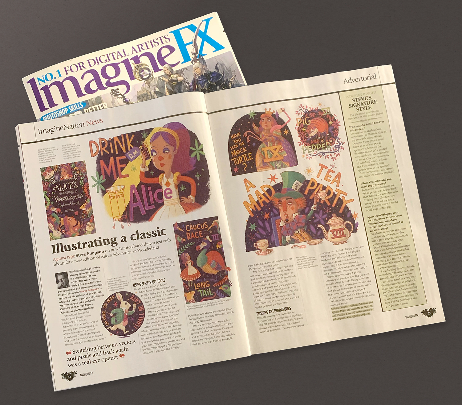
'Alice’s adventures in wonderland'
'Affinity Publisher Workbook'
illustration by Steve Simpson
QUESTIONS FROM INTERVIEW WITH ImagineFX Magazine
What was your brief for this project and how did you approach it?
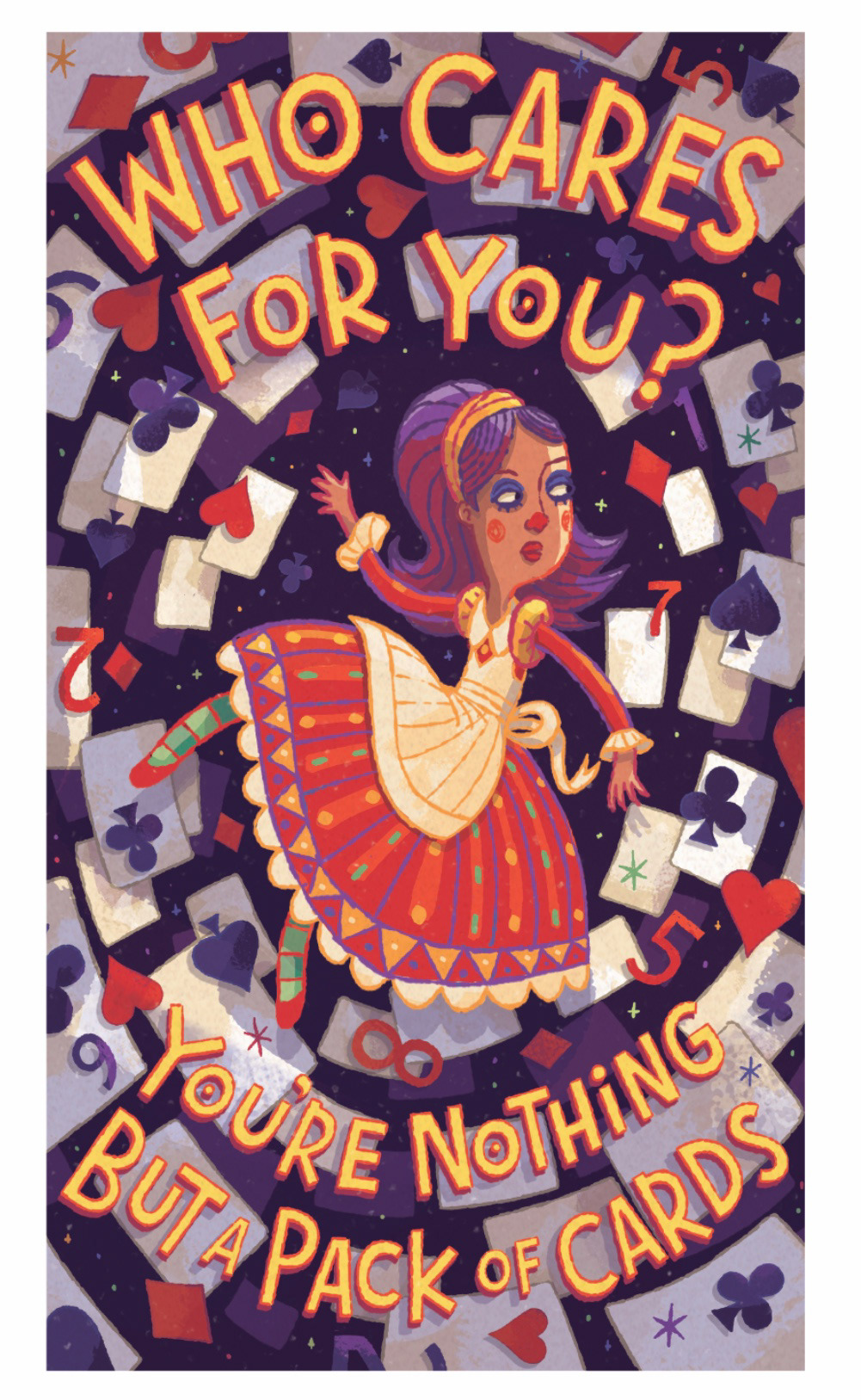
The outline for the brief was very simple - to illustrate Alice in my own style using Affinity Designer - I was given a lot of freedom as to how best to approach it, however as there were parameters to work within, the illustrations had to be created very much with the original text in mind.
Alice’s adventures in wonderland is such a classic I was initially a little apprehensive on my approach - "How do you illustrate a classic and make the artwork look original?"
Firstly, I’m a huge fan of the book
I was introduced to Alice’s Adventures in Wonderland at an early age, growing up just a few miles down the road from Lewis Carroll’s birthplace, and over the years I’ve collected several vintage illustrated copies of the book. I’m most happy when I can combine illustration with hand lettering and perhaps this was the perfect project to do that. Sir John Tenniel’s illustrations (yes, he was knighted for his artistic achievements!!!) broke new ground by integrating text and illustration in this book, which not only visually helps tell the story, but also looks good.
ROUGHS ROUGHS
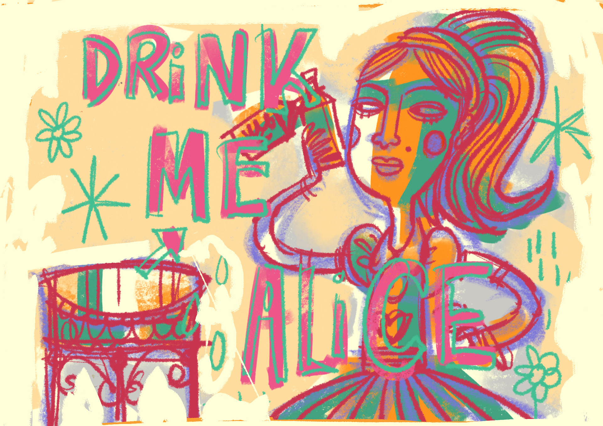
COLOUR ROUGHS
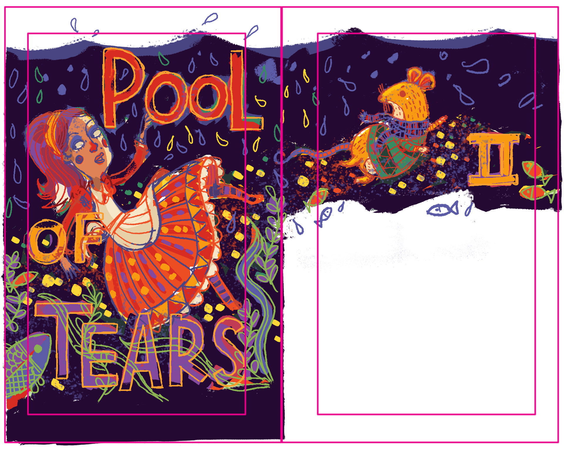
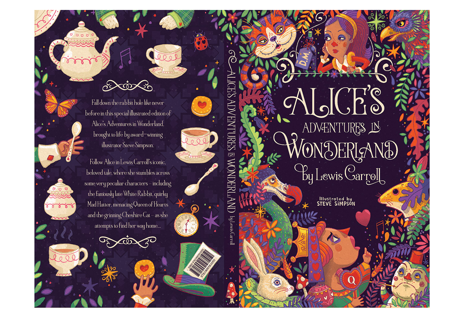
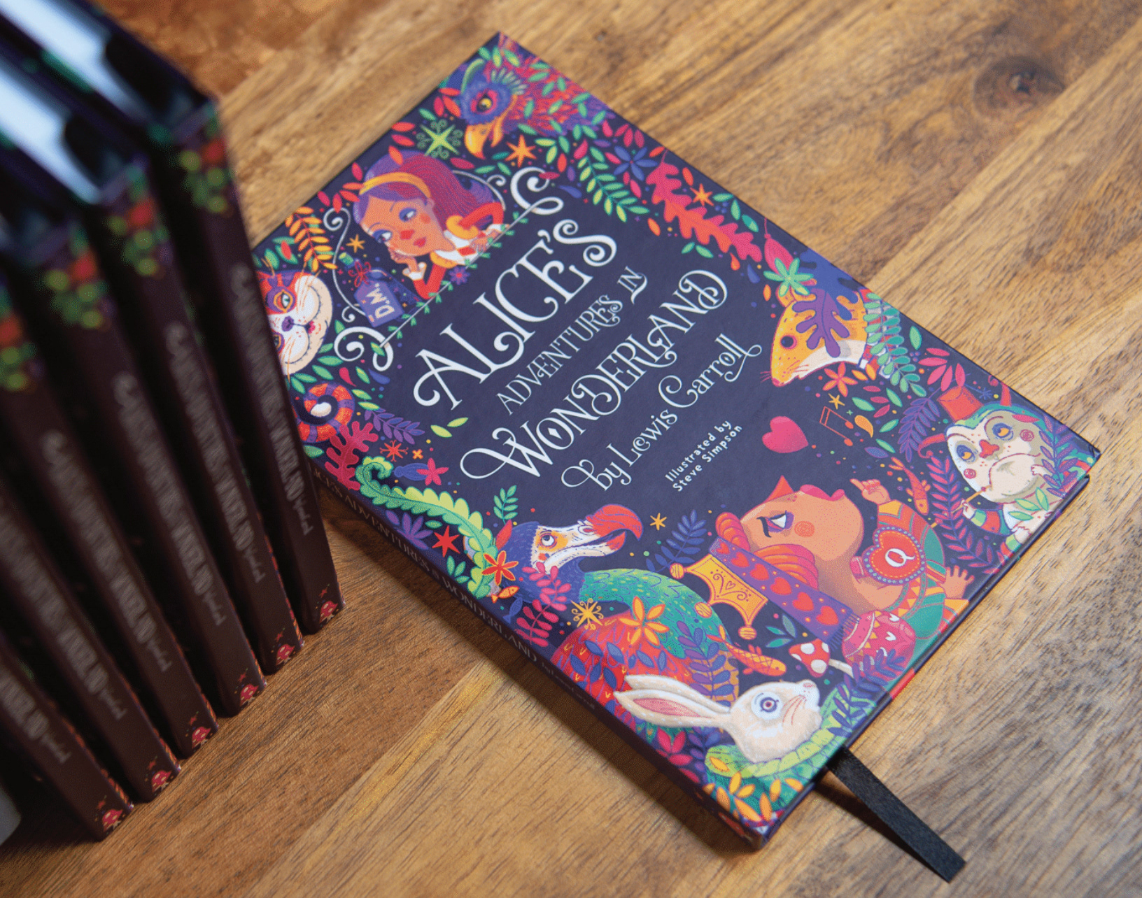
COVER WRAP
Which characters did you most enjoy drawing?
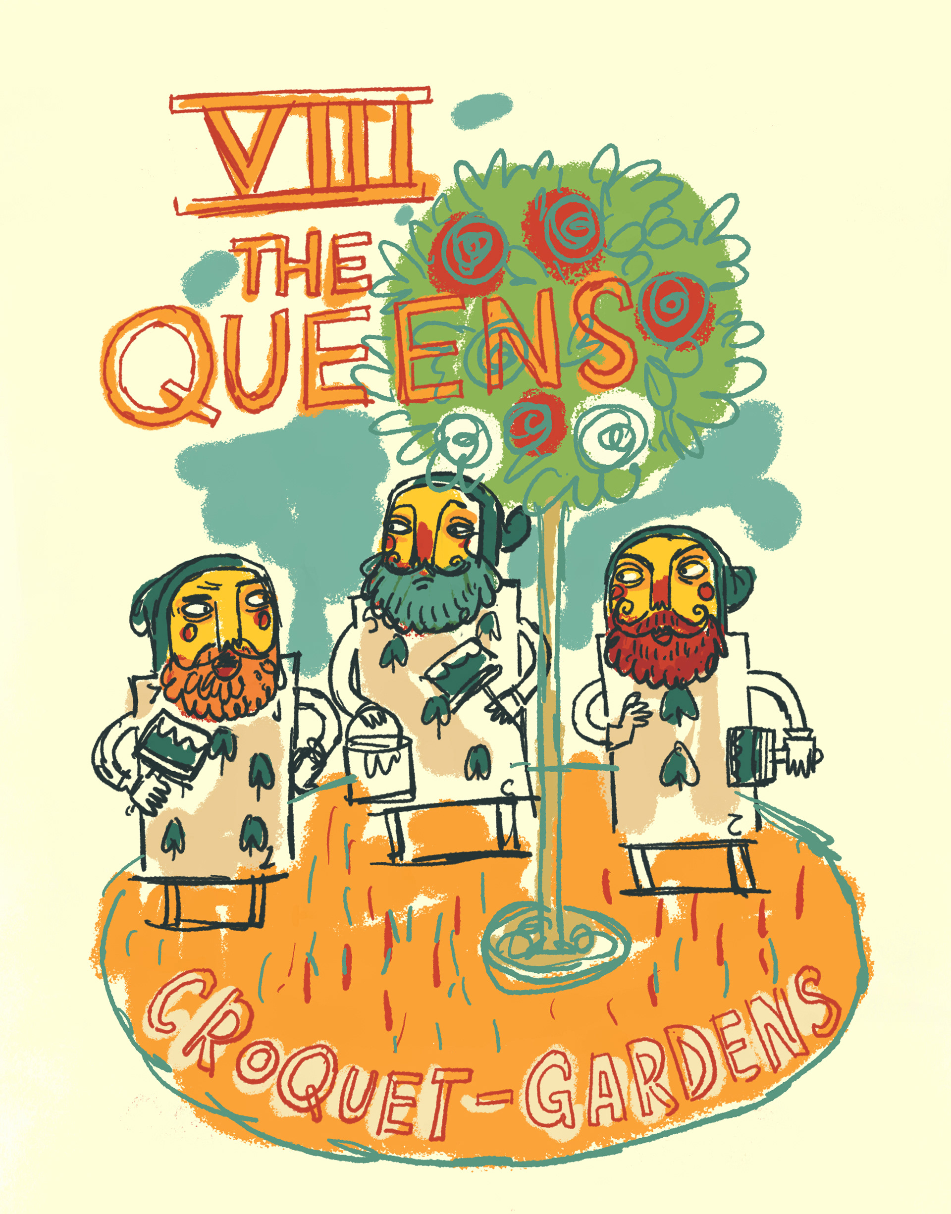
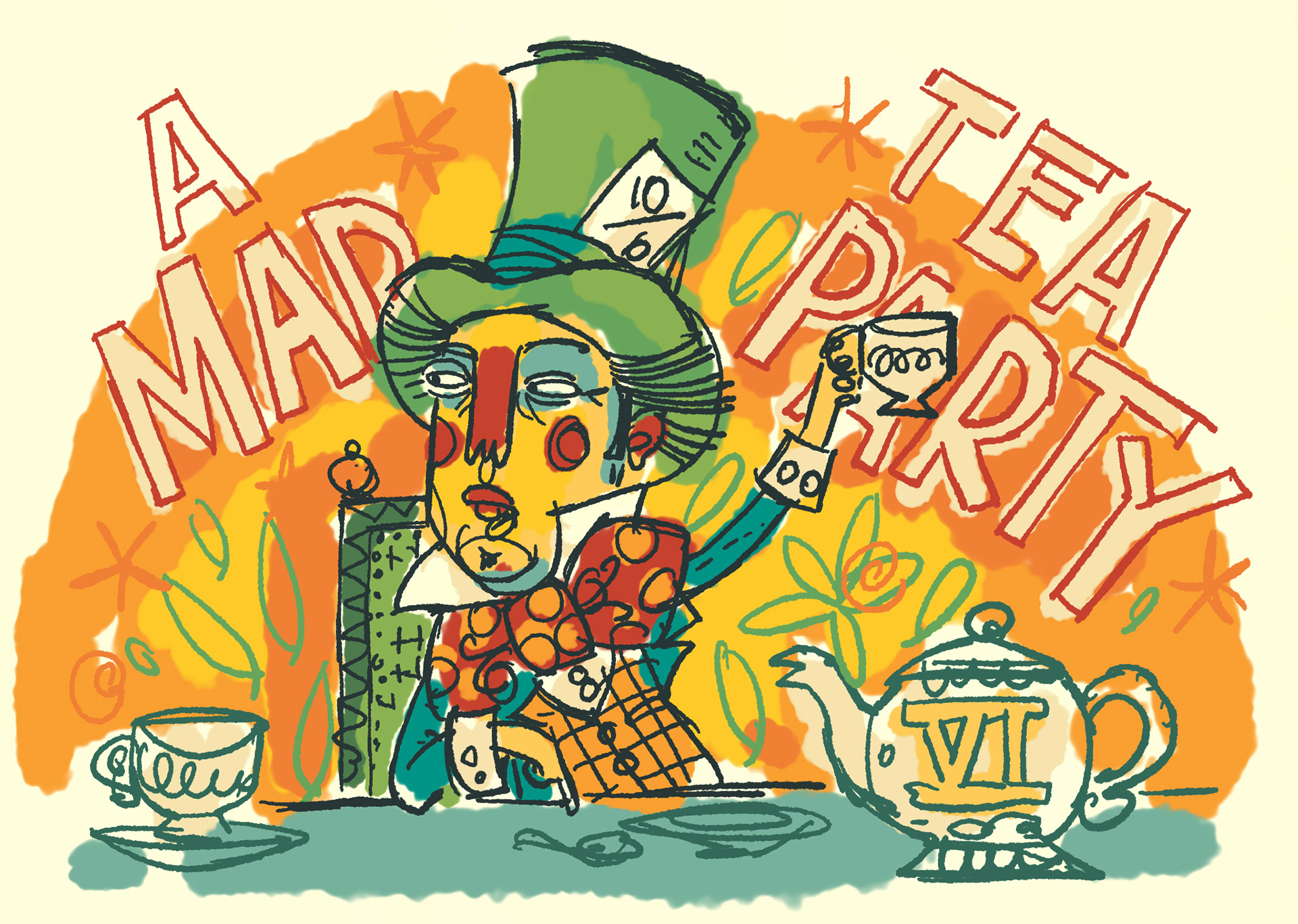
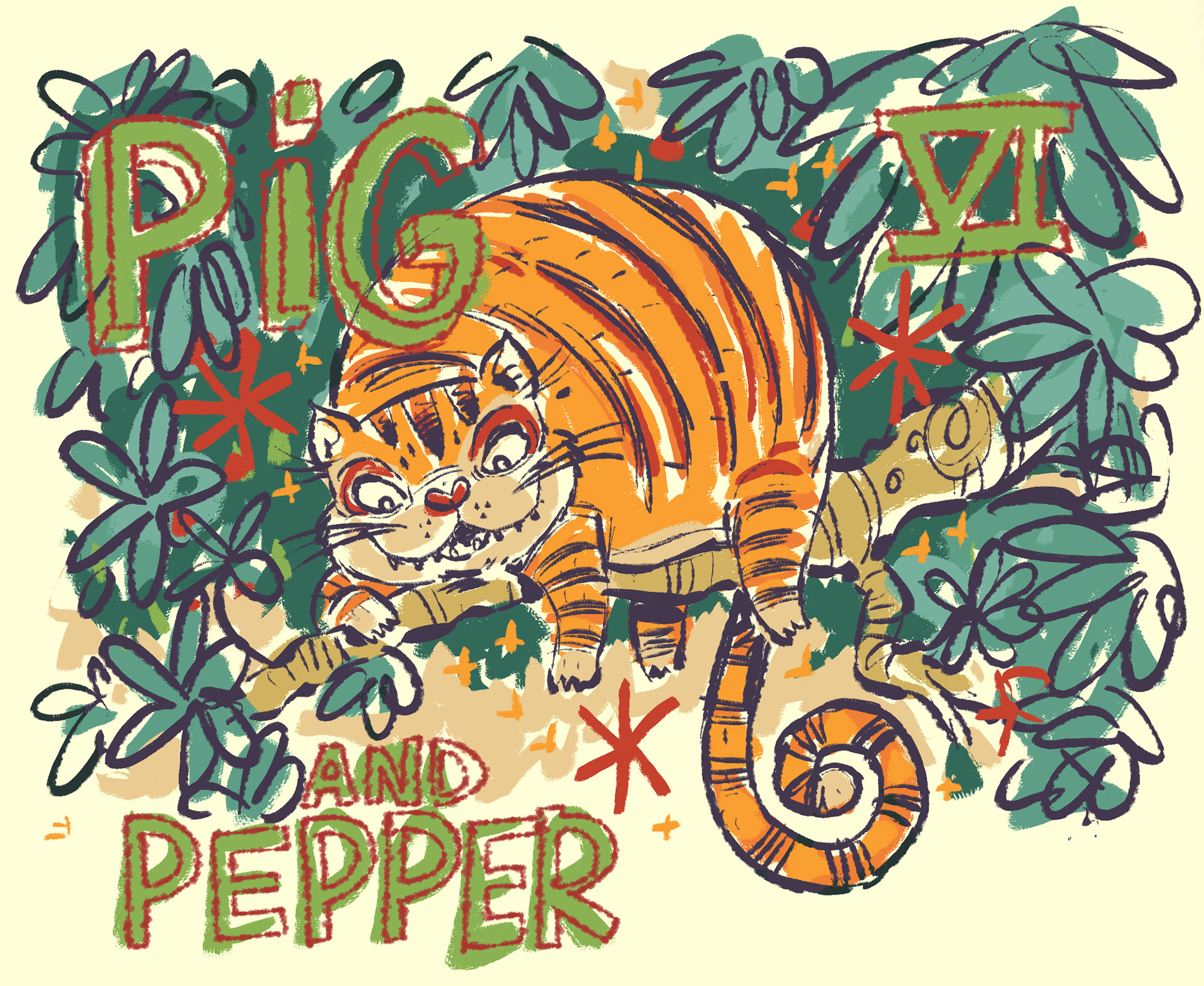
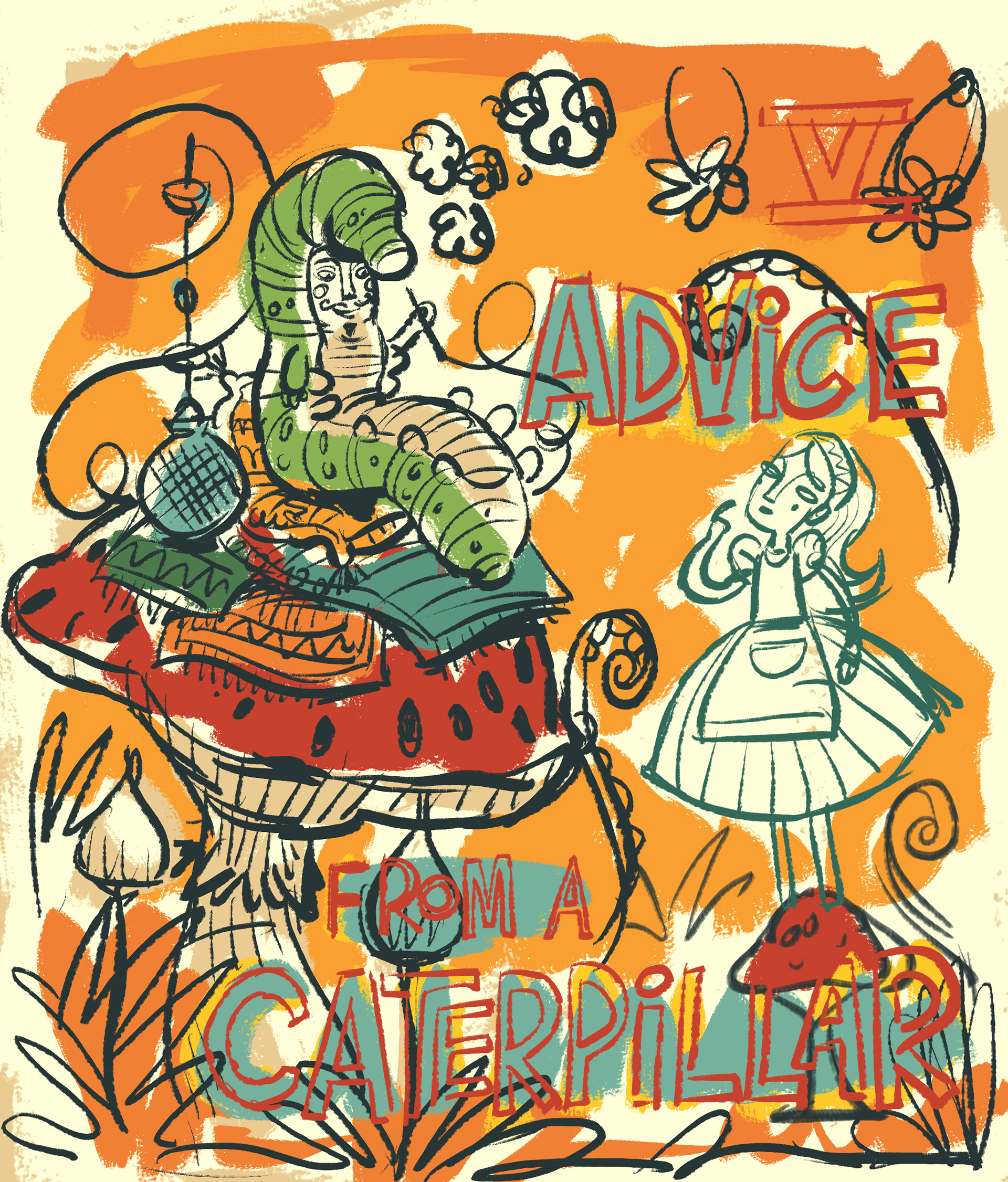
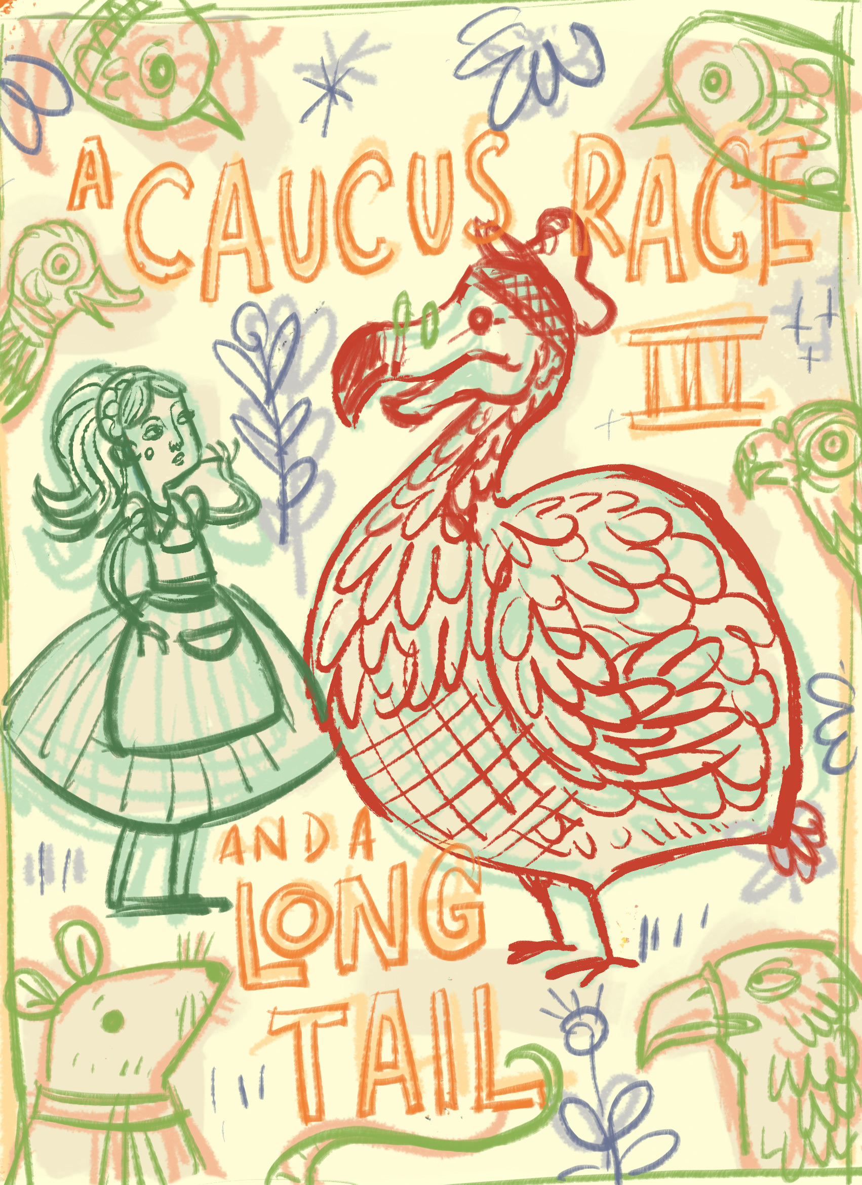
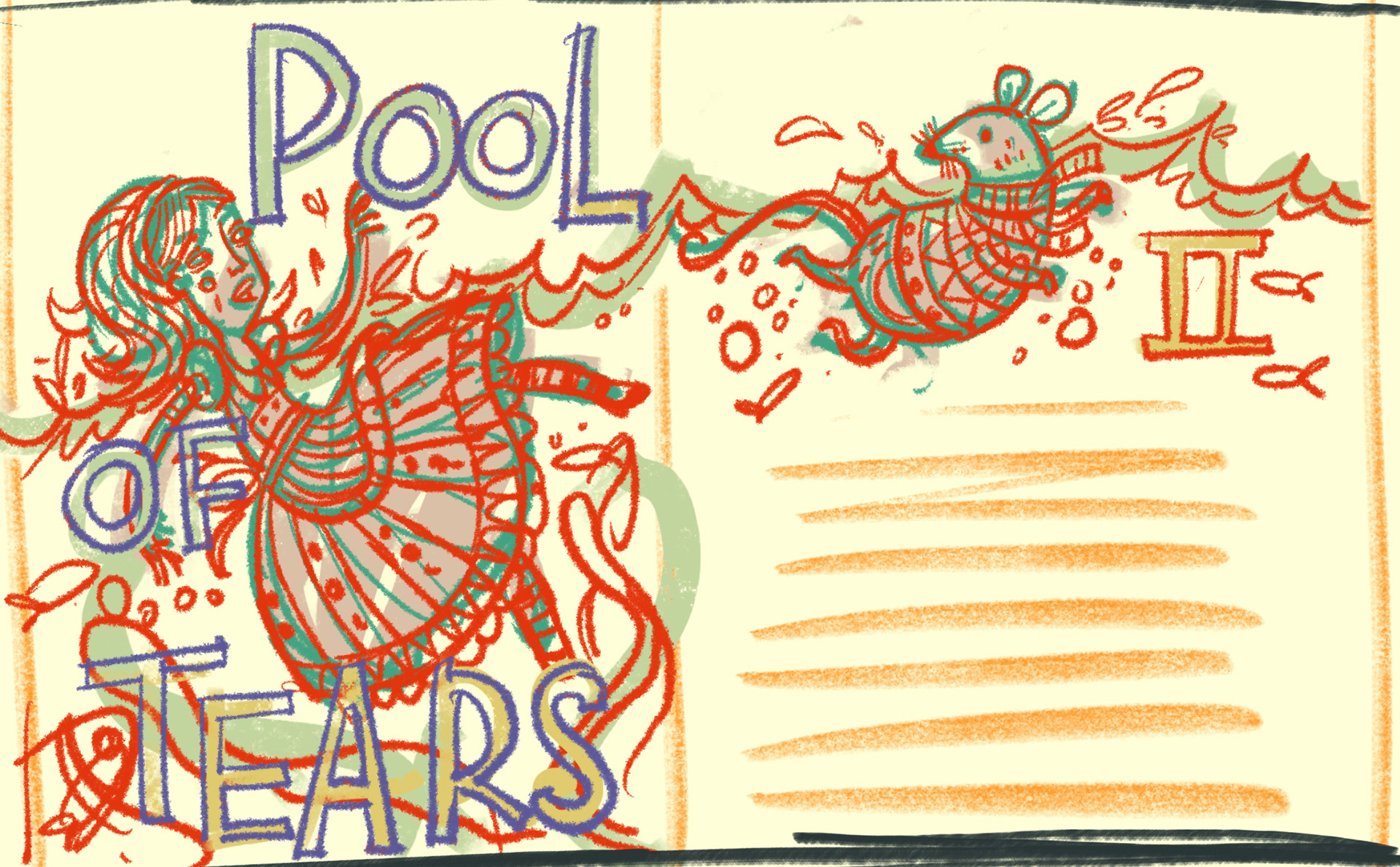
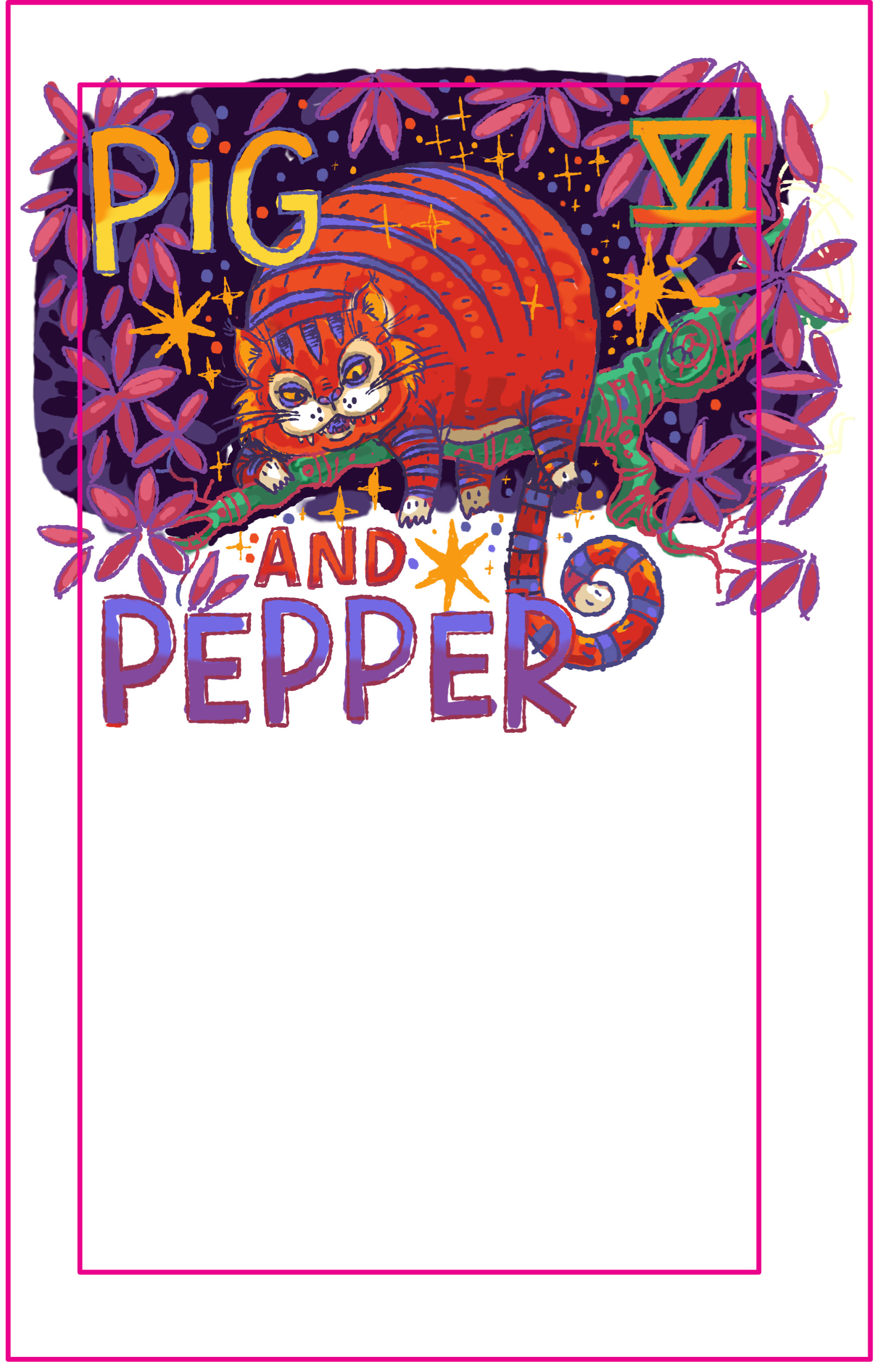
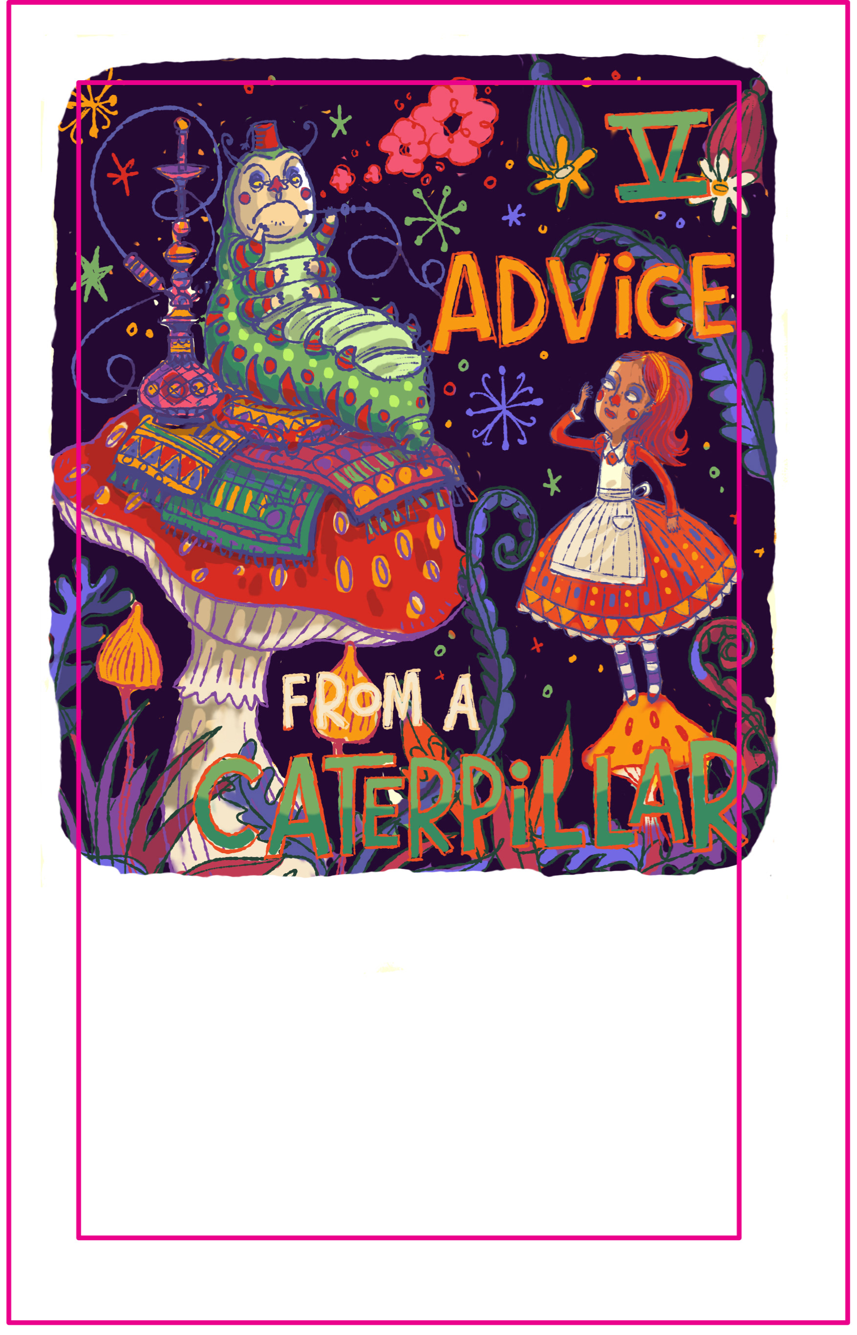
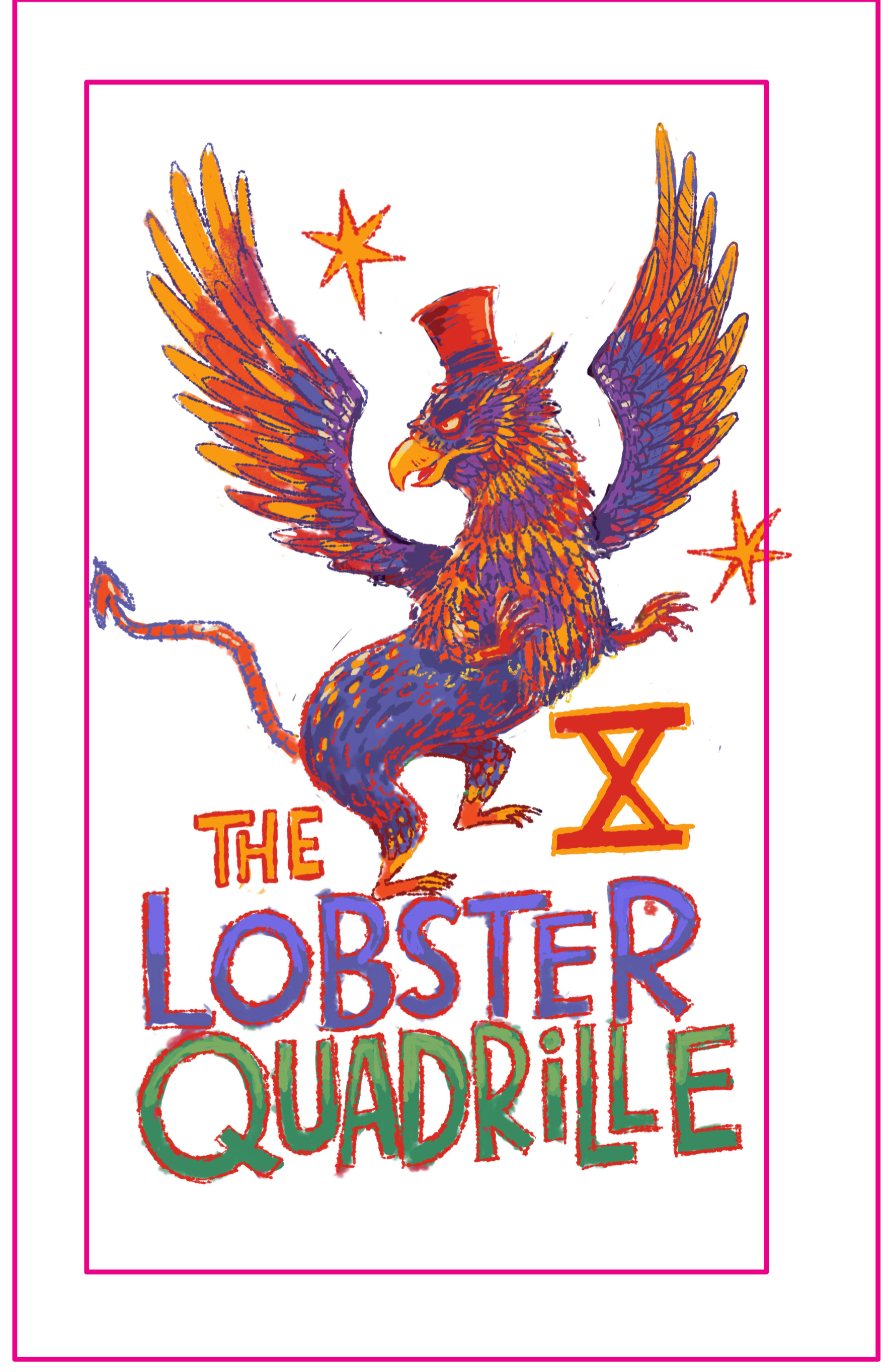
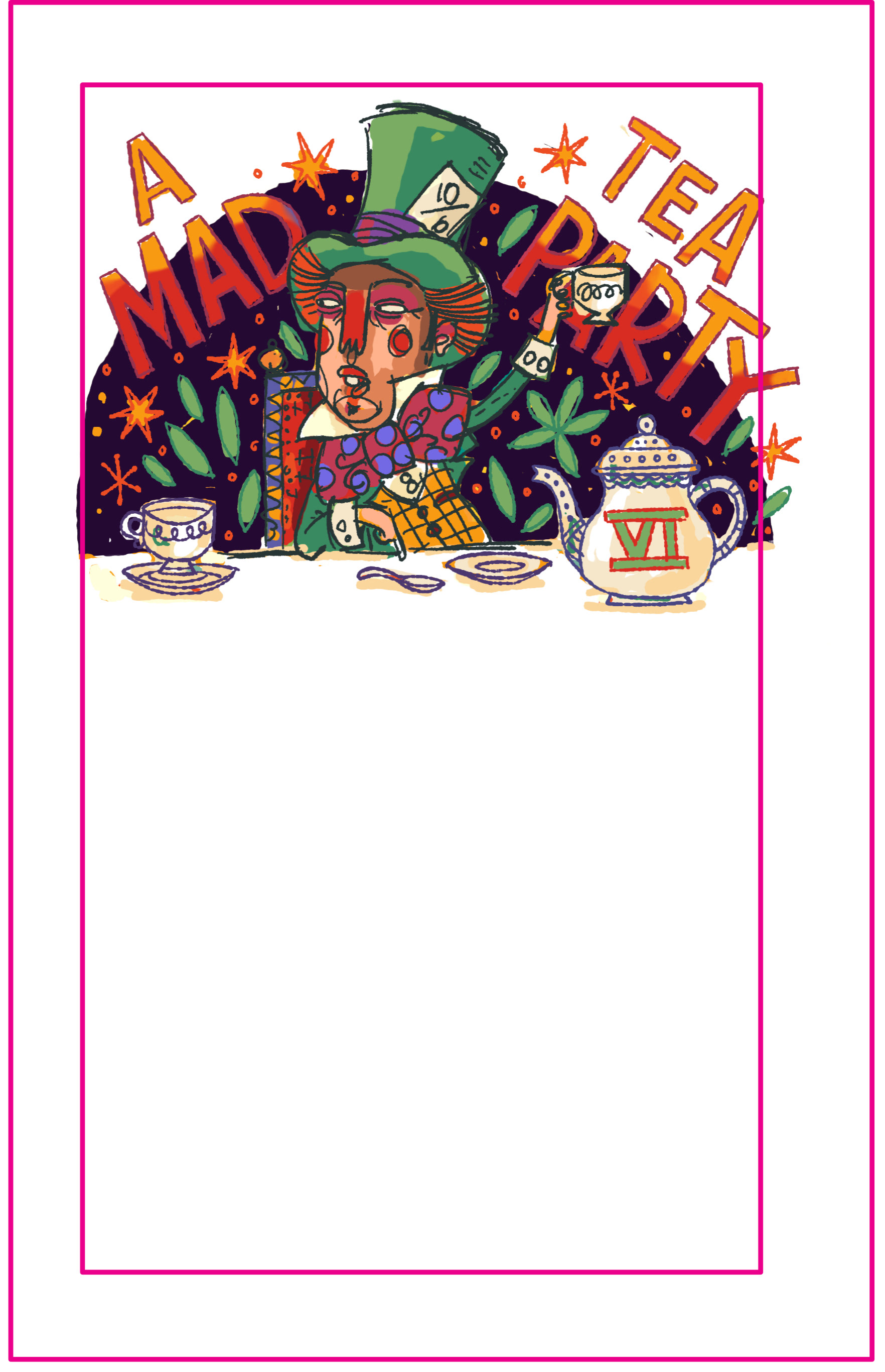
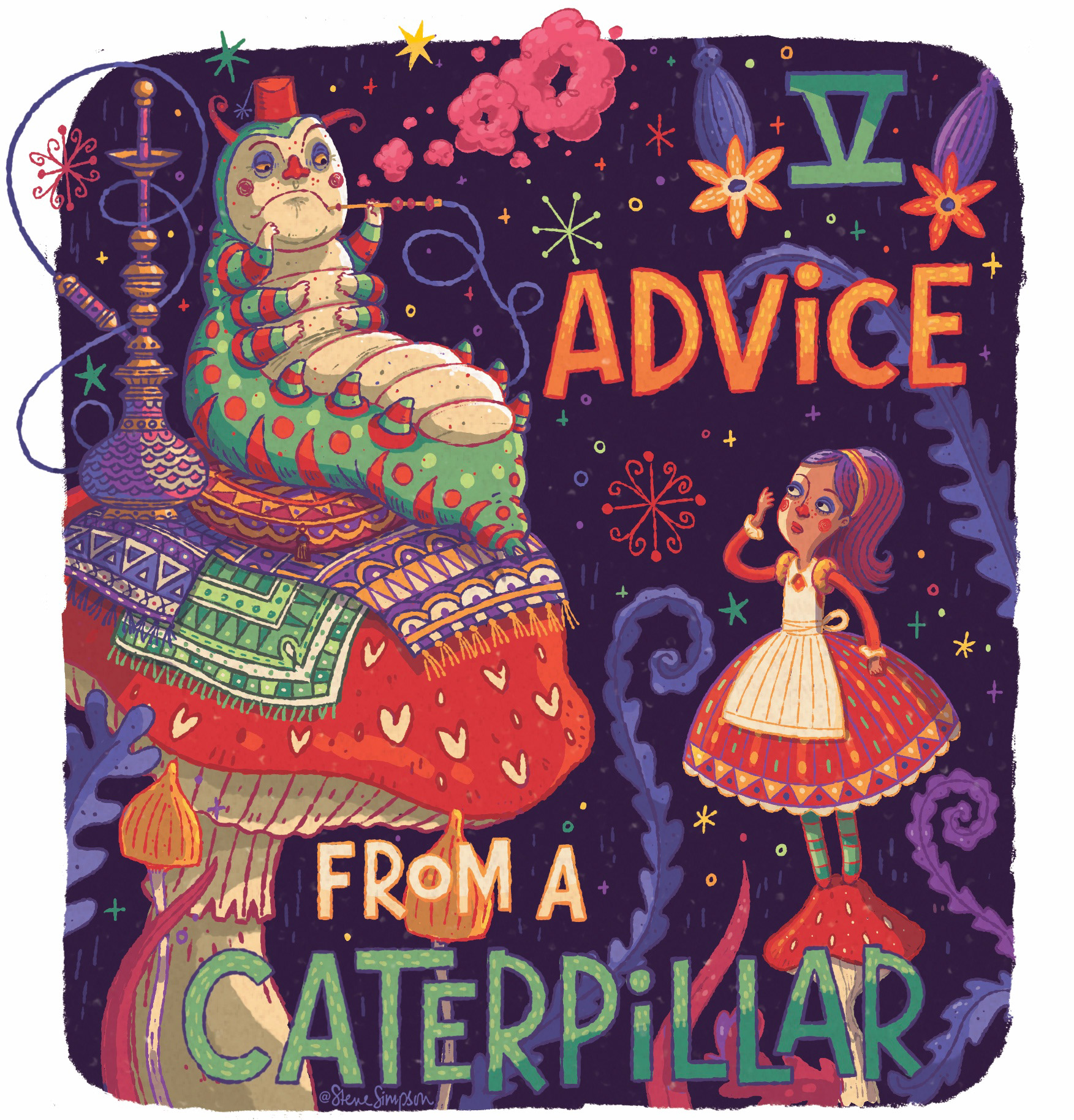
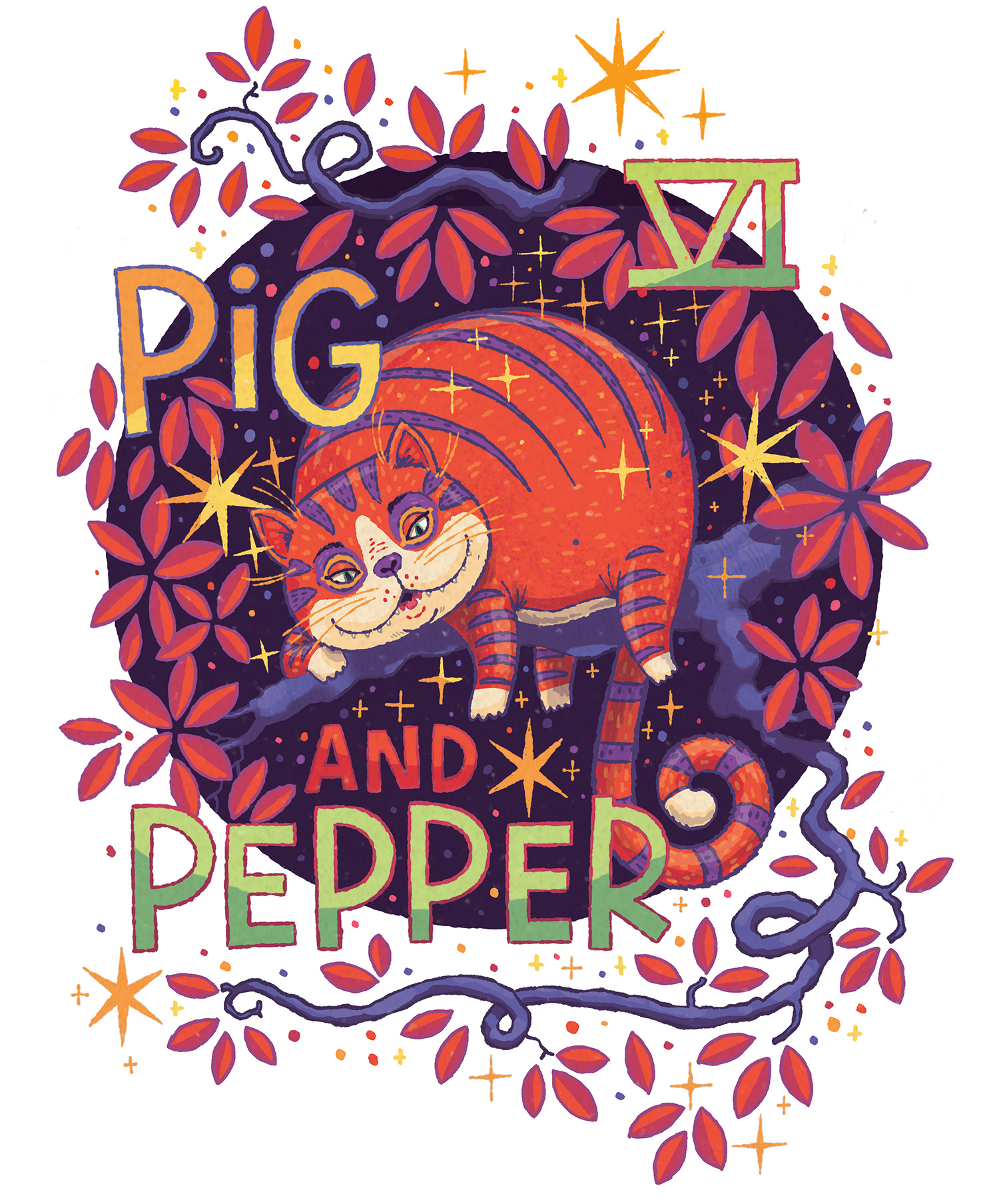
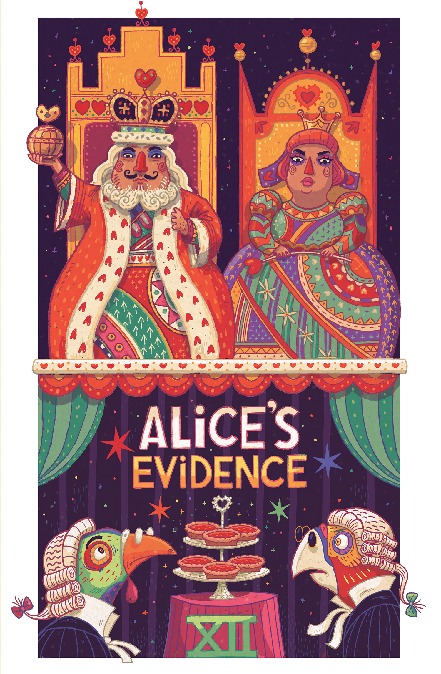
So many of the characters are full of personality, the queen, the caterpillar, the mad hatter - but probably The Cheshire Cat is my favourite- coming from Cheshire I’ve always felt proud my home county’s name was put on the world stage by this guy :)))
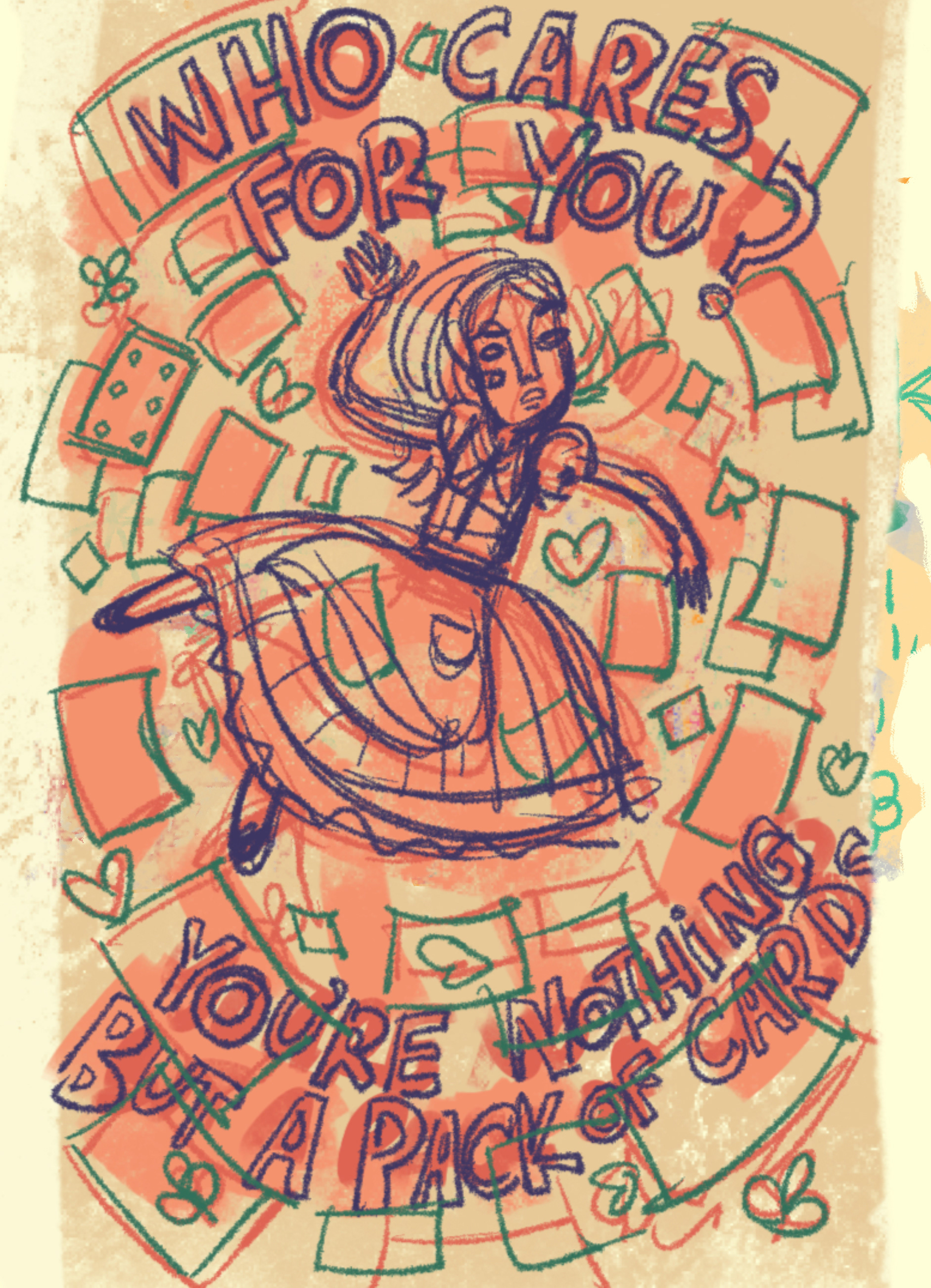
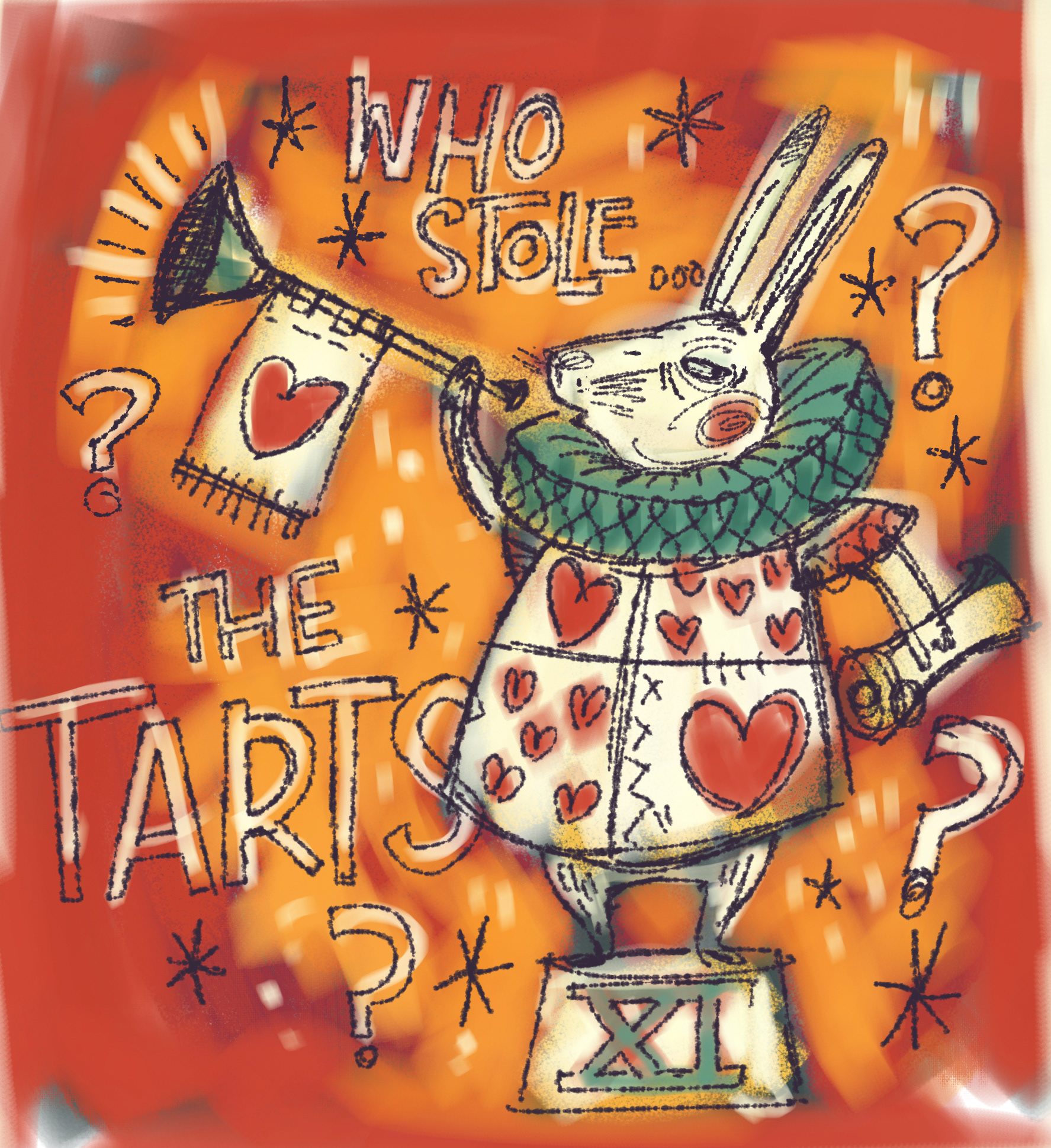
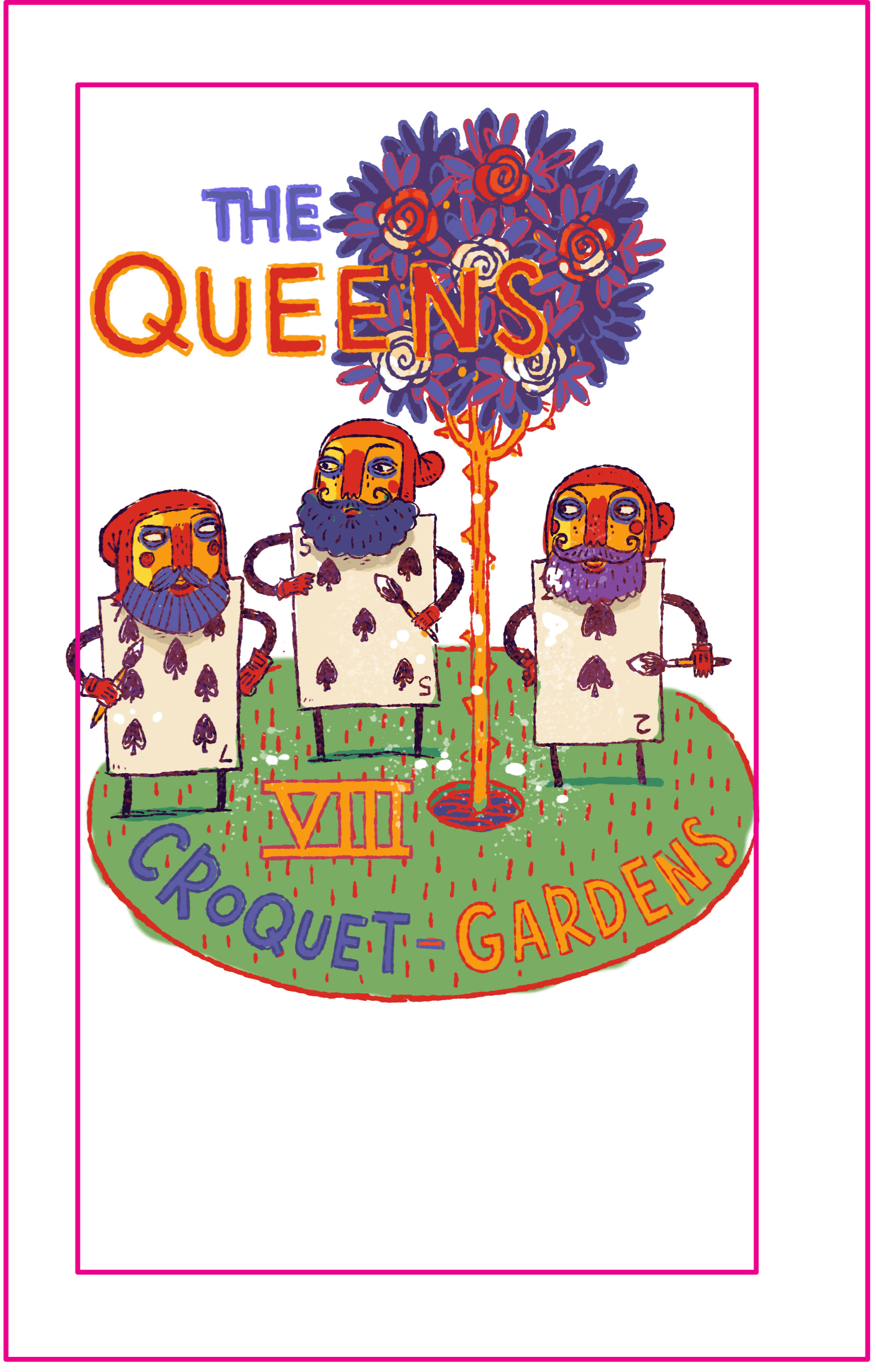
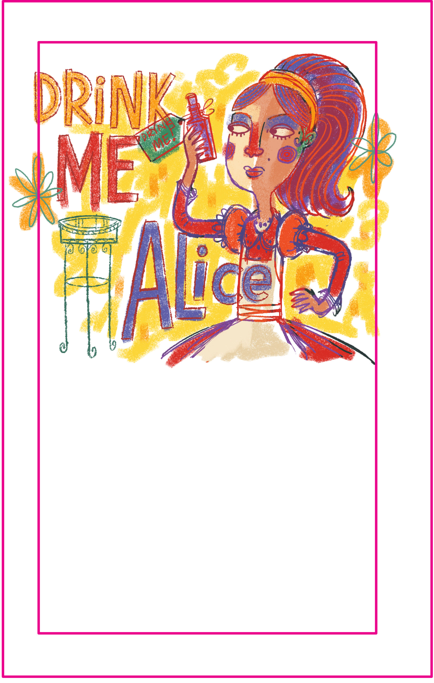
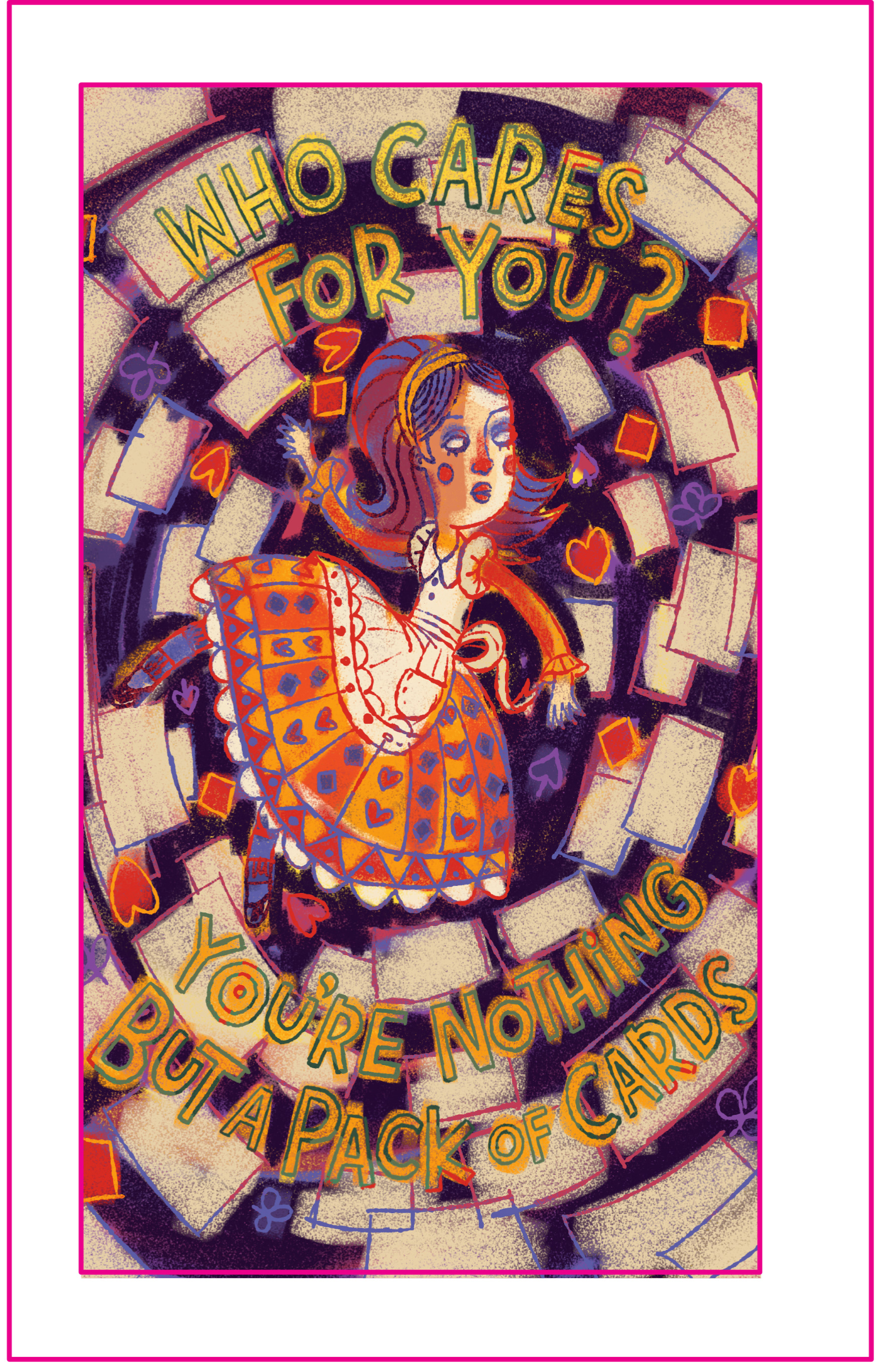
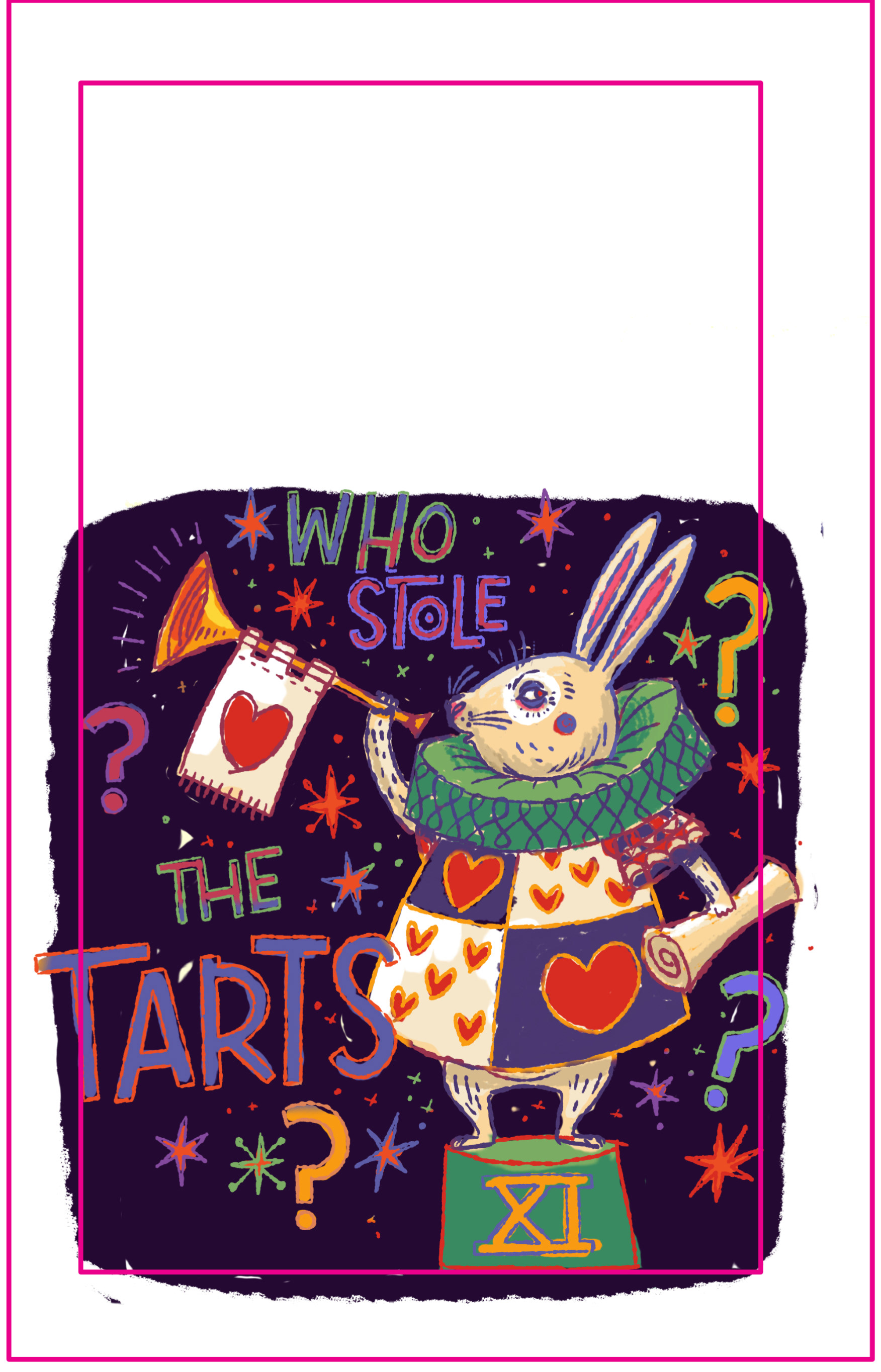
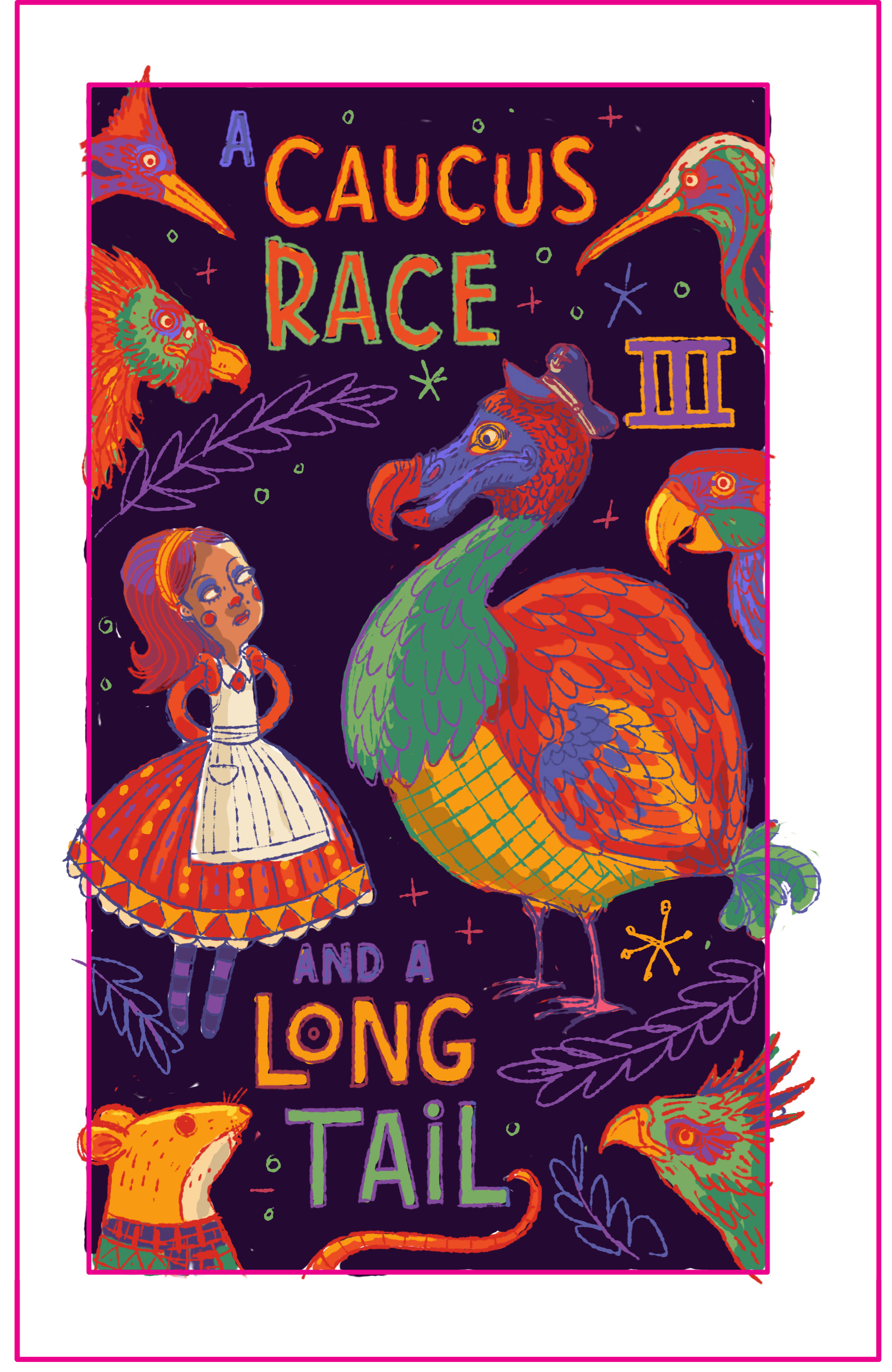
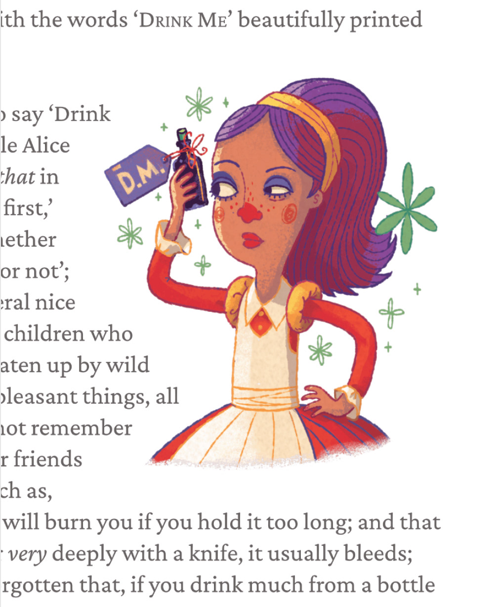
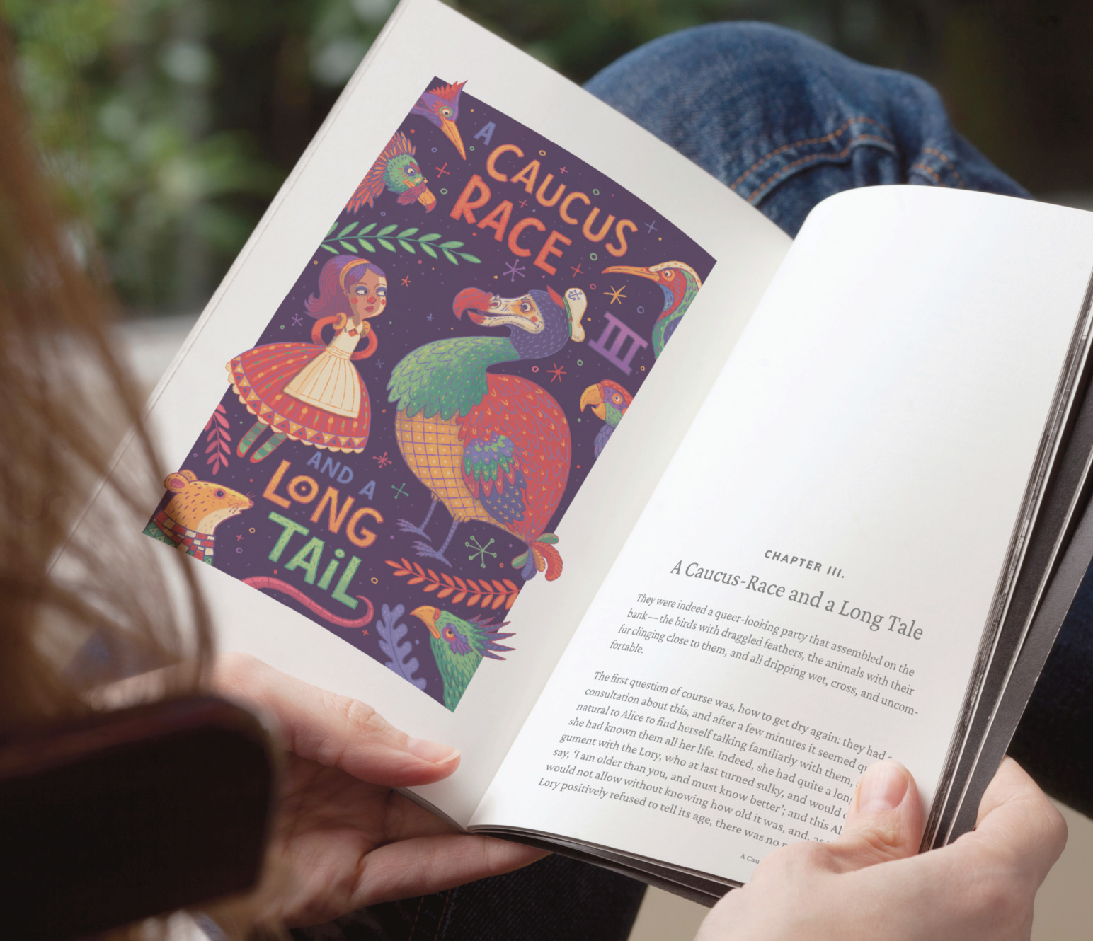
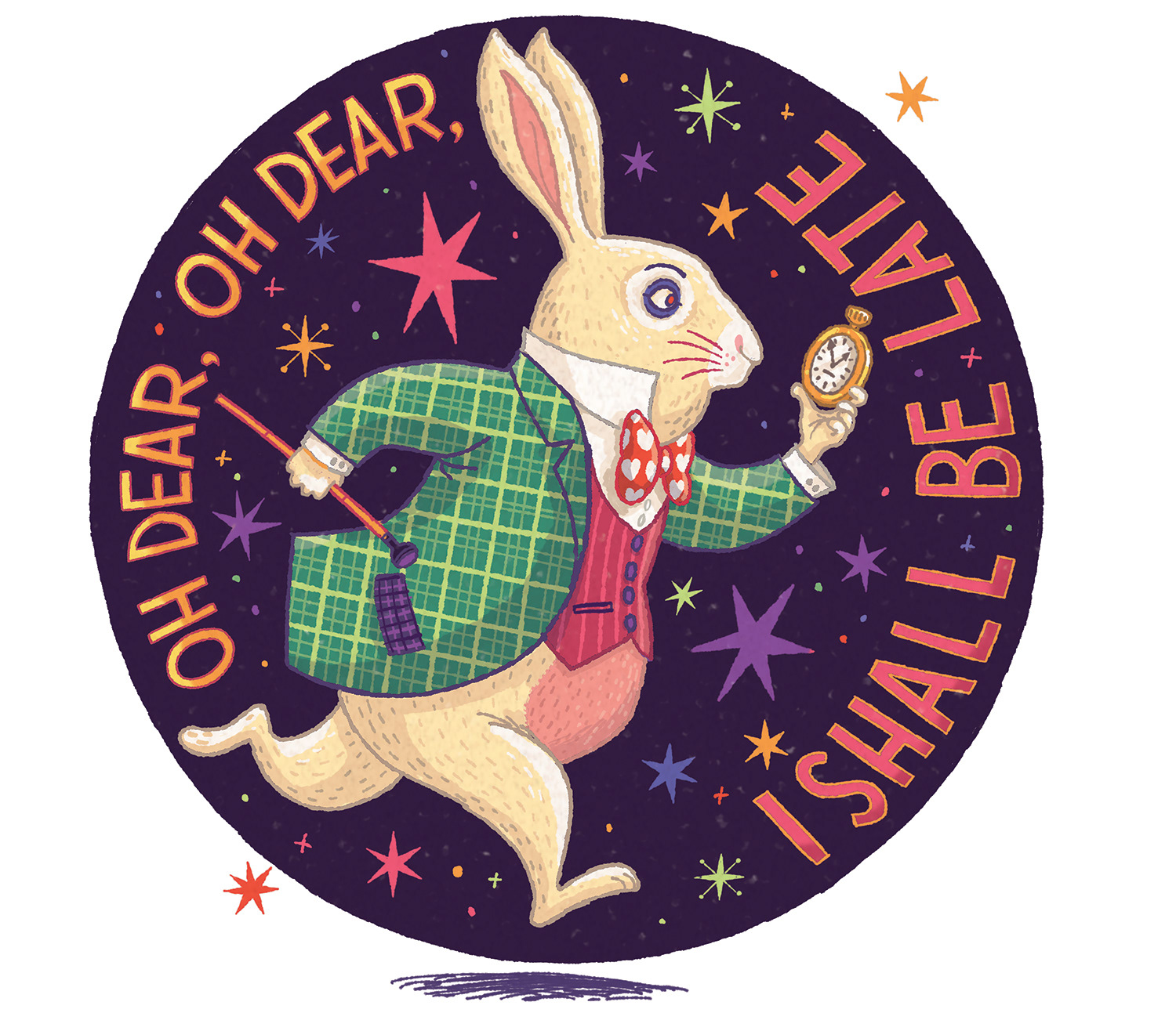
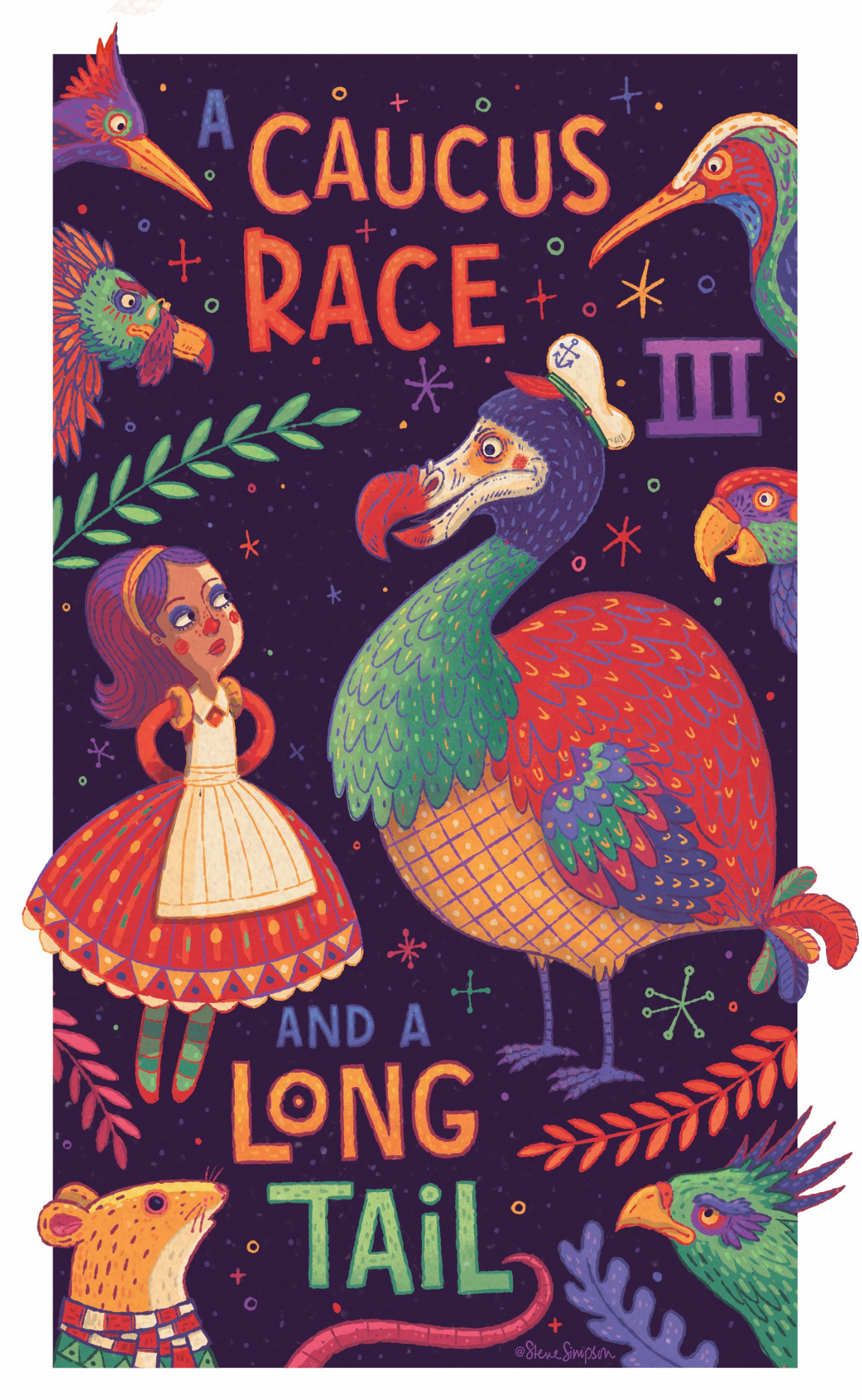
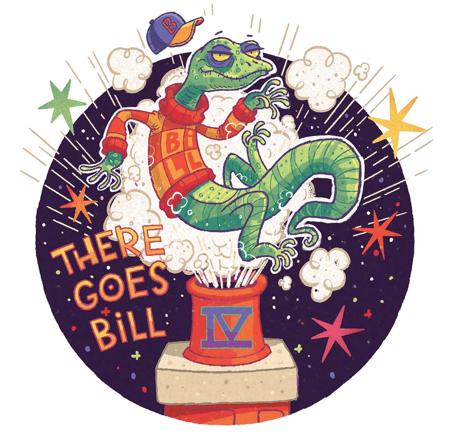
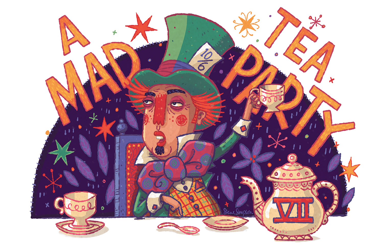
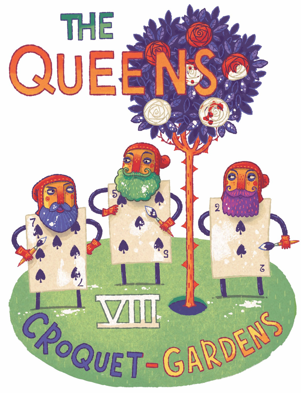
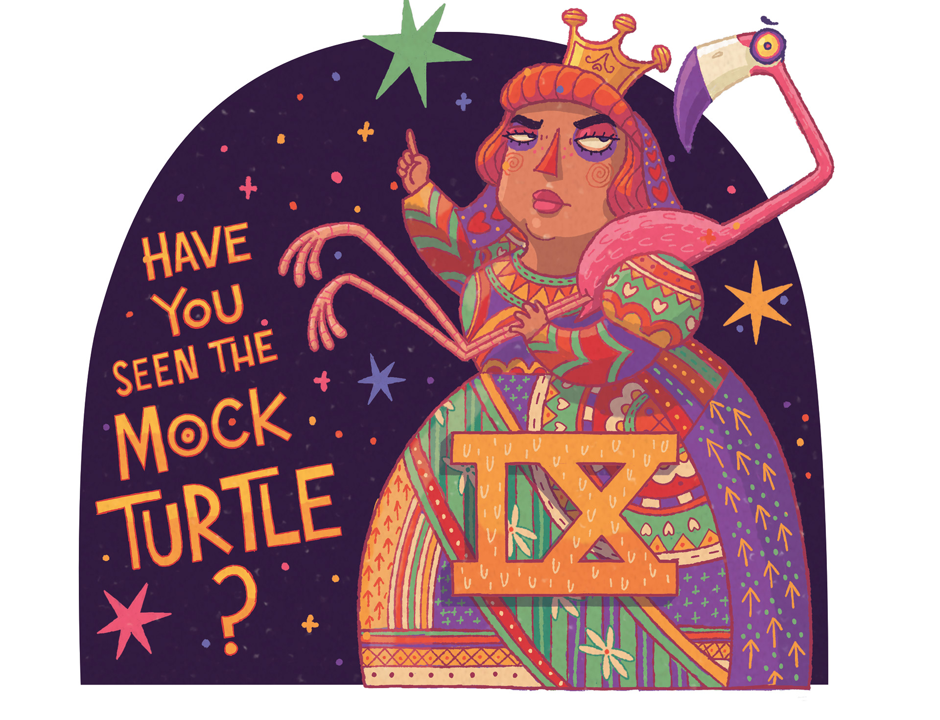
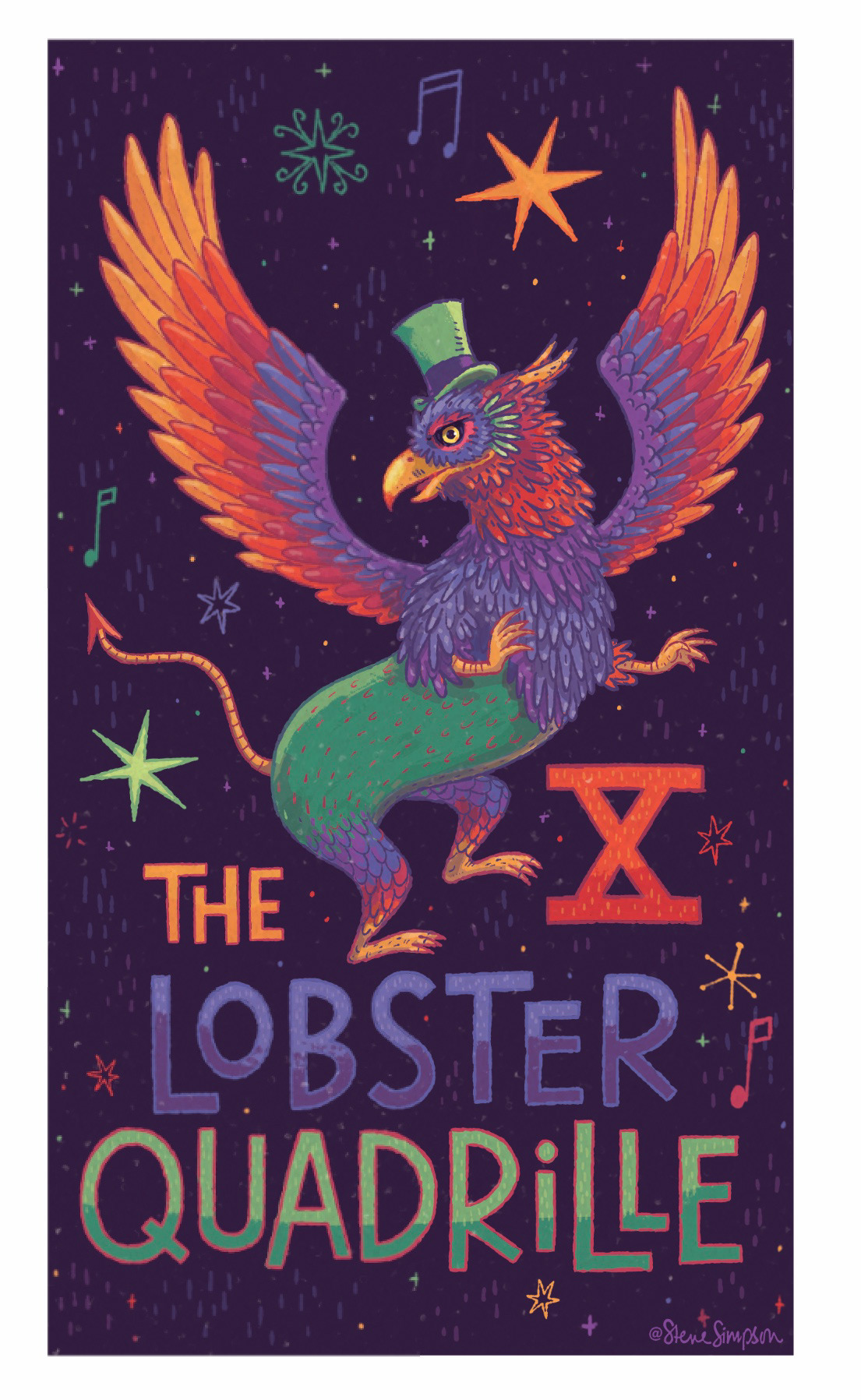
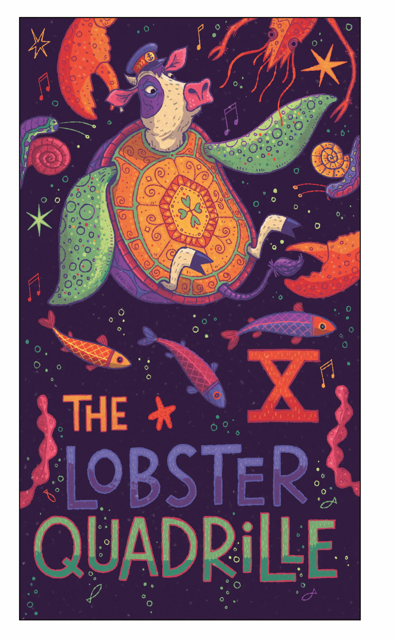
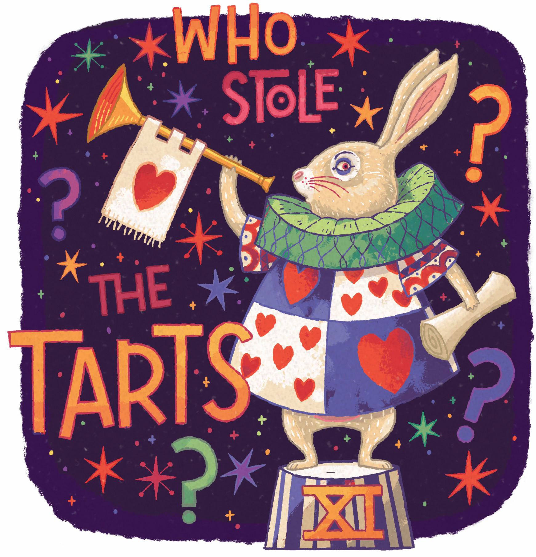
Interior Illustrations
These characters have been illustrated so many times. Apart from bringing your own signature style, was there anything else you looked to do differently?
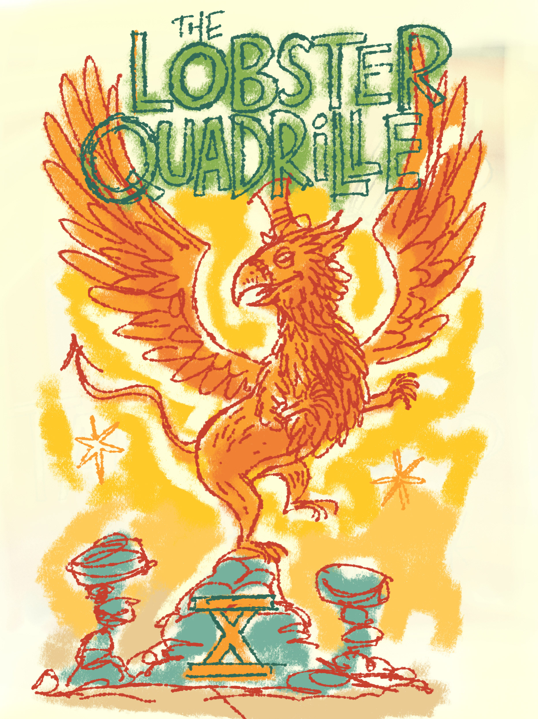
I’m always trying to experiment and develop my style so this was a great opportunity to push pattern, colour and graphic shape a little further - the characters have been illustrated, animated and appeared in live action movies many times - meaning there is a certain way the public expects to see them represented. This allows a certain amount of diversification but really not that much. I can draw them in my style so they don’t look exactly the same as previous renditions but I still needed to stay within certain parameters. So I was looking for a way to add something different - in my research I hadn’t seen anyone incorporate hand lettering into their illustrations- a high percentage of the images are for chapter titles so I decided to approach them and a mix of graphic design and illustration, incorporating the hand drawn chapter titles and Roman numerals into the layout of the drawings -I think this is the part I enjoyed most
How did the Affinity DESIGNER app help you to produce these images?
When Affinity approached me a few years ago to help beta test their iPad version of Designer, I didn’t have an iPad - so playing around with this app was my first experience with using an Apple Pencil (for the previous 25 years I’d been using the mouse) - the first this that really struck me was how I could work in both vectors and pixels - my style is very graphic in its design but painterly in it’s rendering - so being able to switch between vectors and pixels and back again was a real eye opener - so the ability to do this - to move vectors around and then paint within masked shapes really speeded up the process for this project

Thanks for checking out this project - all appreciations and comments are truly appreciated:))
You can follow my latest work on